Grow Your Calgary Business Online
Grow your revenue growth with honest, transparent data driven search engine optimization.
CERTIFIED

MRC SEO Consulting - Calgary , AB - Online marketing
100% transparency, Honest Internet marketing company in Calgary, Alberta, Canada. Easy to Understand Answers. If you are Search Engine Optimization owner and want to see better visisbilty, beat your competitors , rankings reach and conversions through Grow Your Business online Through Calgary SEO Call Or Text Today : 403-386-7427
Expanding Your Sales with Calgary SEO Services
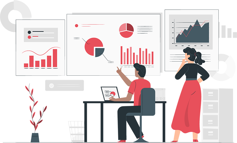
Our services will offer you noticeable results that you can track and rely on. Clients that have worked for us in the past have achieved an average boost of 350% in site traffic and 400% increase in lead generation. As a SEO experts we know exactly how to make your content discoverable, readable, and visible to a search engine like Google. That means you’ll have more eyes on your content and more sales in the bag. . 403-386-7427
Search Engine Optimization
In 12 months of work, we increased the organic search results traffic to 10,000 per month. Using both social media , PPC , Enterprise seo , and content marketing.
There are a few conclusions you can draw from this growth pattern:
- Growing organic search traffic takes a long time
- If you quit early, you will never see the fruits of your labor

INDUSTRY LEADING SERVICES
Results Driven Customized Certifiedonline advertising , mobile marketing and local seo.
FOCUSED DESIGN
Stunning certified Conversion based Web Design
CUSTOM CAMPAIGN STRATEGY
Data Driven conversion rate optimization customized to Calgary Business owners!
PROFESSIONAL CUSTOM DESIGN
Custom web development for your Business.
ADWORDS CERTIFIED PARTNER
Certified marketing agency Google Ads Management ROI Focused Strategies like email marketing, on page seo , off page seo , landing pages and organic seo
CUSTOMER SUPPORT
Available Via Phone, Text Or Email
Website Design
Online marketing goes hand in hand with great web design.
At MRC SEO Consulting, we know that providing a rich user experience experience to your customers is essential to the success of your business.
Get a WebsiteLocal Search Engine Optimization
We grow your local business both on the Google Business profile ( maps) and Organic ranking
Local Calgary SEO is the best method to grow your local business. GBP or maps locations is very important to LOcal contractors and location based businesses
Calgary SEOSocial media marketing
Our ethical methods work based on quality content , brand driven , certified SEO to provide conversions and Search engine marketing. We follow all guidelines that Google sets out while managing to get fantastic results for our customers with ethical conversions.
Social media marketingInternet marketing
Calgary SEO services
At MRC professional C , we want to work with businesses owners who are committed to long-term growth in their companies. We can deliver optimum approach to results through search engine optimization.
403-386-7427
Local Small Business Experts
We are Local small business experts and can help by offering a full suite of services.
We understand the ins and outs of search engine optimization We are all about Calgary SEO We have 100% proven revolutionary Calgary seo companies , For this reason we can ensure you achieve online growth in your business. Call: 403-386-7427. We also service the following locations : Edmonton , Regina , Red Deer and Saskatoon ,Calgary
Analyze NowAWARD-WINNING Search engine marketing - Small Business Experts
Calgary Seo strategies are a long Term Strategy , Get Started Now!
Get A QuoteLocal Search Engine Optimization
Calgary Marketing Services and online marketing is about growing your traffic!
You are probably saying to yourself, “that’s a bit more overwhelming than I perhaps anticipated!”, or maybe you already feel overwhelmed at the thought, and that’s why you are here. Either way, we can take the stress and anxiety out of your online marketing related apprehensions. Call for easy to understand answers!
403-386-7427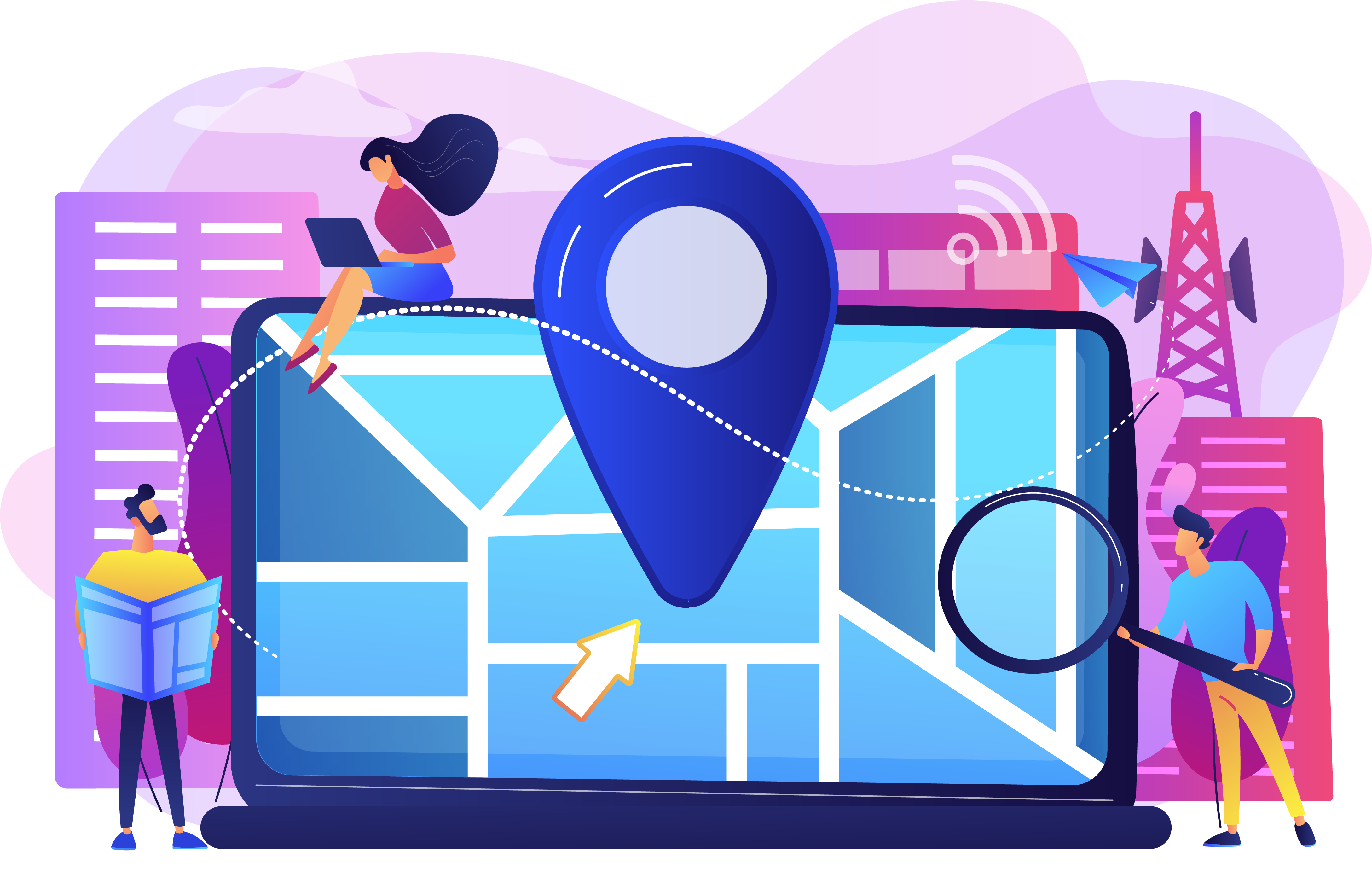
Why Choose MRC SEO Consulting
Its important to have a solid SEO strategy to get your website page found and ranking. Your customers have not gone away , they simply have a found a better way to find the products and services they need online , IF YOU ARE NOT IN GOOGLE - YOU ARE LOSING CUSTOMERS TO YOUR COMPETITION!
Search engine optimization
MRC SEO Consulting can guarantee that your SEO campaign is in the right hands. We aim to remain at the forefront of all the latest SEO, digital marketing and online advertising information to bring you the most cutting edge and effective search engine optimization techniques and search results.
Get Started NowContact MRC SEO Consulting
Our calgary agencys have helped countless businesses page expand and flourish my always making sure they get the most for their money. Increase their brand awarness , increase rankings and Coversions on Google